I’ve been doing a bunch of reading lately, so I thought I’d share some highlights with you. First, I Seem to be a Verb, by R. Buckminster Fuller. This book, written in 1970, attempted to capture the spirit of the day by combining graphics with snippets of text. The top and bottom halves of the book are flipped, so that you’d read the top half of the pages, and then turn the book over when you got to the end and read the other half back to the beginning:
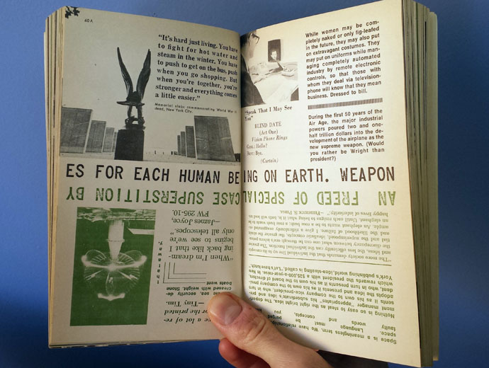 Page 60 of I Seem to be a VerbThis book really shows its age in some ways, but is timeless in others. There’s a real sense of excitement and purpose that’s typical of architectural manifestoes of the 20th century (see the great Programs and Manifestoes on 20th-Century Architecture, edited by Ulrich Conrads, for more). The formatting reminds me of many later works, most notably those of Rem Koolhaas. Unfortunately, it also has the problem of being a little too optimistic. Fuller was convinced that mass production and automation was going to free mankind from its labors, allowing all of us to reach our full creative potential. Unfortunately, we all know what really happened, at least in the U.S., as a result of industrial automation. Just take a look at Detroit, starting around that time.
That being said, a few choice quotes:
“Thinking is the consciously disciplined separation of relevant feedback from irrelevant feedback.” p. 152a
“The totality of spaceship earth and universe is ahead for all of us. (Mankind was born with legs–not roots.)” p.19b
“Thinking is a momentary dismissal of irrelevancies.” p. 64b
Another book worth checking out is Thoughts on Design, by Paul Rand. Rand was a graphic designer, most known for his work in the 1950s to 1970s, when he designed the iconic logos for IBM, Ford, Westinghouse, ABC, and others. The book, written early in his career, presents his attitudes about design, as well as some examples of his work. Though the following passage is not about architecture, I do believe it applies to most design fields:
Visual communications of any kind, whether persuasive or informative, from billboards to birth announcements, should be seen as the embodiment of form and function: the integration of the beautiful and the useful. In an advertisement, copy, art, and typography are seen as a living entity; each element integrally related, in harmony with the whole, and essential to the execution of the idea. Like a juggler, the designer demonstrates his skills by manipulating these ingredients in a given space. Whether this space takes the form of advertisements, periodicals, books, printed forms, packages, industrial products, signs, or TV billboards, the criteria are the same.
That the separation of form and function, of concept and execution, is not likely to produce objects of esthetic value has been repeatedly demonstrated. Similarly, it has been shown that the system which regards esthetics as irrelevant, which separates the artist from his product, which fragments the work of the individual, which creates by committee, and which makes mincemeat of the creative process will, in the long run, diminish not only the product but the maker as well. (p. 9)
Both of these books are quick and enjoyable to read; I highly recommend them. If you do read them, please share your thoughts in the comments.
