It’s important to be clear in your communication. Of course mistakes get made accidentally, but it’s important to try to be careful so that your words aren’t misinterpreted. In architecture, as in any other technical field, we have our own terminology and jargon. Using the wrong word can lead to confusion, resulting in the wrong thing being built. For example, many people use the words concrete, cement, mortar, and grout interchangably. However, they mean very different things in the context of construction. Using the wrong one can have dangerous results, so it’s important that we all agree on what each word means, and stick to it.
Fortunately, I don’t have any personal examples of horrible building failures to share here. Partly, that’s the result of taking extra care in how I communicate my ideas. However, I will give you some examples of unclear communication that I’ve spotted around the neighborhood, from people who have given things a little less thought:

This sign is lacking in consistency. Are gloves sold singly, or in pairs? By noting “a pair” for socks, I now have to wonder about the gloves.
Another thing that’s confusing is unnecessary apostrophes. Typically these aren’t a typo, either. A typo is an accident–something that the writer would have avoided if they’d noticed it. But people put them everywhere, even when not appropriate. In this case, I recommend this book.
If someone uses the apostrophes incorrectly, but consistently, we can figure out what’s happening. Where the confusion really sets in is when the mistake is made inconsistently. In the worst case, the reader is constantly trying to figure out what’s going on. In the best case, it’s just annoying and distracting.
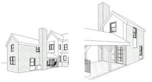
The two main physical products that architects make are drawings and specifications. The drawings show the physical relationship between different products, materials, and systems. The specifications are written instructions that describe in detail what products, materials, and systems are to be used, how they are to be installed, and what standards are to be followed.
It would be easy for the drawings and the specifications to be uncoordinated. The last full set I produced had eighteen pages of architectural drawings, four pages of structural drawings, and 185 pages of specifications. It takes a rigorous system, as well as a lot of focus, to keep these documents coordinated. Terminology must be consistent (and that includes punctuation!). Symbols and hatch patterns on the drawings must be meaningful, and must mean the same thing on every page. Only then can the architect, client, and builder be sure that they are all understanding things in the same way.
For specifications, the key is consistent terminology and format. I use the Construction Specifications Institute’s three-part specification format. This means that each product, material, and system has a section devoted to it, and each section is broken down into three parts. This consistency makes it easier to find the information you need quickly. You can see an example here.
For the drawings, it’s much the same. It’s important to make the drawings efficient. Hatch patterns show what a material is without reading a note:

This appears on the first sheet of every set I produce. It lets readers know right away what hatches they’re going to be seeing, and how they’ll be used. There is also a list of abbreviations on that same sheet.
Within the drawings, aside from consistent terminology and drawing style, I also use formatting to make the drawings easier to read and to reduce distractions.

In the drawing above, you can see some examples. There are hatch patterns used to indicate concrete, drainage fill, earth, insulation, and wood. Notes are aligned and evenly spaced to avoid being a distraction. When the components of the wall are listed, they are listed in order, from inside to outside. All of this is done in an effort to achieve clearer communication.
I enjoy doing this work, and I enjoy using care to make sure everyone else knows what needs to be done. That’s why it drives me crazy to see sloppy signs on stores, and sloppy drawings and specifications on jobsites. Sure, a badly-written sign isn’t a matter of life or death, but if it’s representing your business, it should be right–right?